Summary
Improving the policy navigation and section at Citizens Advice, giving the policy team a digital platform to create content.
Outcome
• 87% increase in page views per session
• 20% increase of users duration accessing content
• 22% increase in traffic to the policy hub
• Improved design maturity building in processes within the design system community
View live website →
About
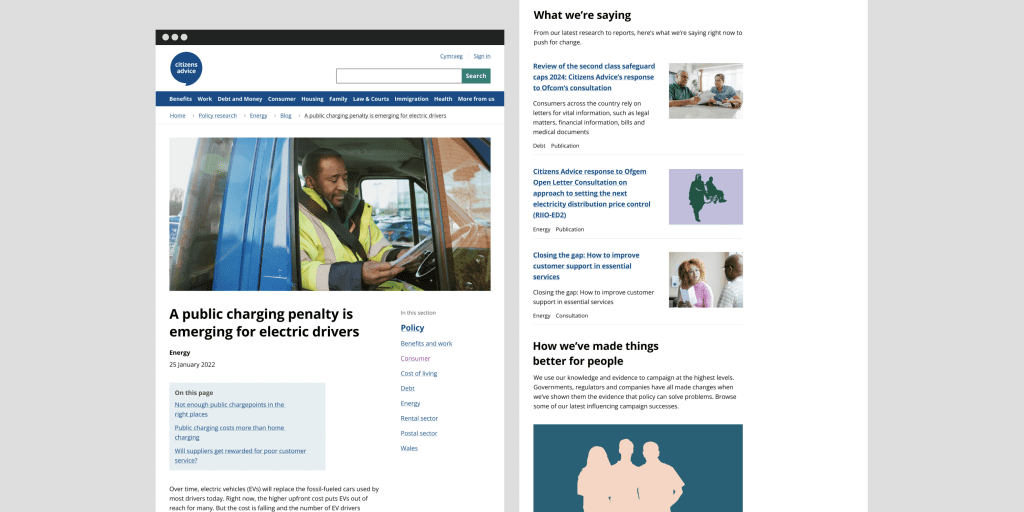
Citizens Advice has a public website that serves advice to millions of people but the site hosts additional corporate content and amongst that is the policy section which hosts unique insight. It was my role to work with stakeholders and the Non-advice product team to effectively migrate from the old Content platform to the new one and make a better user experience.
Shaping the project
In the discovery phase data was gathered that uncovered some of the historic problems of the policy section which allowed me to understand the key challenges stakeholders and users were facing.
- The website wasn’t built to allow content creators to experiment with content and showcase data
- Users were struggling to navigate through content outputs
- Content wasn’t accessible for users as it hosted historical PDF’s
- The website didn’t tell our brand narrative and showcase the policy team’s unique insight
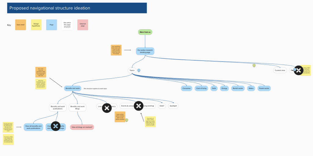
I used Google analytics gathering quantitative feedback on users and the current structure of the website which identified some key issues in the navigational structure of how the different content types work together. From this I fed back the information to the Product Manager advocating for us to focus on the navigational structure of the section as there was a clear user need for this.
Ideation
In the define phase I collaborated with the User researcher to gather insights we had internally and mapped out these hypotheses which I used as a basis for prototyping. I did a competitors analysis to review what our competitors were doing in their content and design as well as built a site map. These methods allowed me to map the prototype against design hypotheses which helped easily articulate to the policy team why design decisions were made.
Following the first iterations of designs in Figma I presented back the design work and broke down the components facilitating a workshop to align policy, brand and marketing and content designers if what was presented met their needs of crafting content and brand storytelling. I broke down complex language around components for non-specialist and when we got too focused on small detail bringing us back on track towards an MVP approach by bringing in our design hypothesis to the session.
Findings
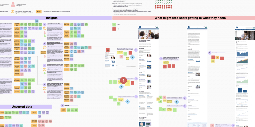
After the session I supported running some usability sessions using Figma to build the prototype and advocated testing the navigation and the ability to navigate through content outputs, which uncovered iterative changes on components and the page.
- Users want to navigate by topic which happens early in their journey
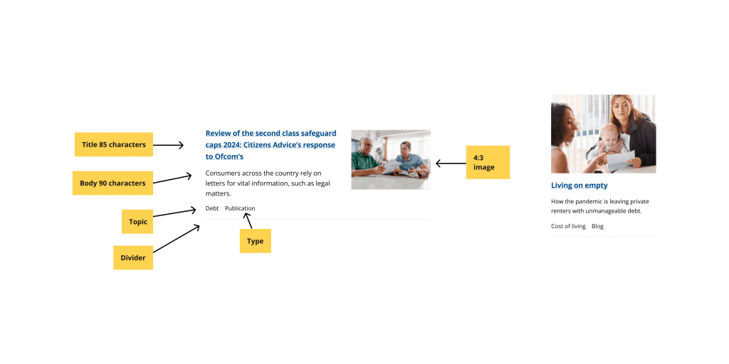
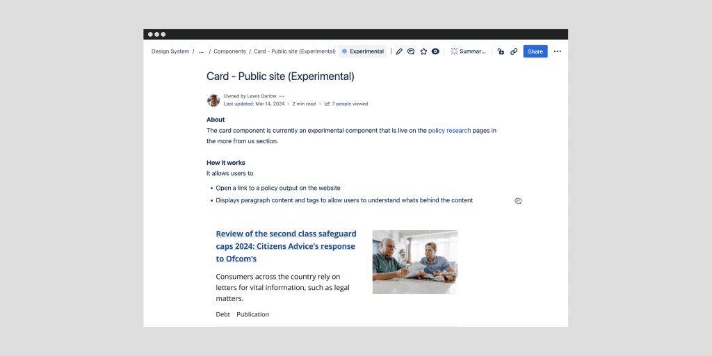
- The card component displayed part of the content that was in the output and this wasn’t helpful for users
- Related content didn’t allow users to navigate onwards in their journey
The insights allowed me to further develop the prototype ahead of the development phase
- Consider the information architecture of the page moving topic navigation higher on the page
- Place a character limit on the card component description and title to make it more helpful for users navigating content
- Change the card component to display only topic tags to support users in finding information based on topic
- Remove the related content module from the prototype reducing complexity
Development to launch
Working with the developer on the team I made sure to include them early in the design work to understand what was technically possible and how the architecture of the content model would be set up. Since we had new components I worked with the developer to define documentation on specifics of these components across interaction, sizing and typography and helped build out Jira tickets to document the development work.
Advocating for accessibility
As part of the project the policy team wanted to implement a third party platform Flourish that hosted their data. I spent time reviewing the third parties accessibility and the data visualisations created by the policy team to understand and identify some areas that would make the data hard for users to access:
- Our brand palette wasn’t designed to be used on a white background but in colour pairs which means the data points don’t meet WCAG AA contrast ratio of 3:1.
- Some of the data visualisations on Flourish don’t support accessibility features for users like keyboard navigation etc
- Labels and headings that were created by the policy teams would make it hard to identify the graphs for screenreader users.
I discussed these issues with the policy team which presented a challenge as the policy team wanted to experiment with content that isn’t accessible. I discussed how it would affect their key user group by presenting feedback from the disability equity group alongside quantitative data from key external stakeholders. This allowed me to build empathy and steer towards some iterative change for the platform and policy team, this included:
- Collaborated with brand and marketing to create an amended colour palette that met the WCAG AA ratio for colour contrast and documenting clear guidance on how to make data and labels accessible.
- Worked with the developer to understand if we could add an alternative format of CSV to the Flourish embed component to support graphs that don’t have all of the accessibility features.
Design system the long term product strategy
The policy section was the first large migration for the corporate part of the site. On this journey part of the challenge was working with a design system that was built for advice content. Realising this I presented back to the design system community in a show and tell with user needs at the forefront on the contribution of new corporate components alongside showing how we could use these components to meet content needs across the rest of our non-migrated corporate pages considering the long term scalability of the components. Following the presentation as a community we decided that we would need an ‘experimental’ category of components that would be tested in particular products until there is a clear user need across the other products which has led to a contribution process to the design system.
Outcomes
- Advocated for accessibility creating guidelines to ensure data visualisations were accessible for users and building empathy with users
- 87% increase in page views per session
- 20% increase of users duration accessing content
- 22% increase in traffic to the policy hub
- Improved design maturity building in processes within the design system community
- Considered the long term strategy of the product and how new components built can be reused and scaled across other content areas
- Launched an improved navigation for users and empowering the policy team to craft content